For those unfamiliar with the game Taboo, it is a word-guessing game. Players go through a stack of cards as fast as they can, trying to get their partners to say a particular word by describing it. The tricky part is that you can’t use any of 5 other words listed on the card in doing so. For instance, if the word in question was “kayak,” the list of forbidden words would be something like “boat, water, paddle, airline, flight” (the word kayak referring both to a kind of aquatic transportation as well as a website where you can get price listings for flights). It is one of our favorite games of all time.
The great thing about Taboo is that you have to get really creative with your reference points. Being forced to describe objects or concepts without the go-to key words you would normally use is great for expanding your thinking, especially if you are embarking on a new project. It’s also great for understanding how other people see the world as they describe it in new and unusual ways.
Here at PDA Studio we like to use something we call Design Taboo to help us move forward in defining and developing our projects. To play it, you come up with a list of 10 questions to which each person on the project has to give a one-word answer that they write at the top of a card. They then draw a line underneath that word and come up with 5 words that they think most people would use to describe that word. A deck of Design Taboo cards is thus created and shuffled, and the game begins.
As it turns out, Design Taboo is a great game to play for branding, especially when you have to name an organization or company. Working with groups and brainstorming can be challenging - you often run the risk of only the strongest personalities in the group getting their voices heard. Playing a game like this gives everybody the chance to contribute without the fear of judgement, because the game makes the brainstorming indirect. You think you’re playing a game, but really you’re fleshing out all the different ways in which your core concepts and identity can be interpreted or envisioned.
Recently, PDA took Design Taboo to our client, a women-run media company out of San Francisco. We were hired to design their logo, identity and website, but they hadn’t come up with a name for their company yet. We got out the cards and asked them for their one-word answers to the following questions:
If your website were a historical figure, who would it be?
What word describes your ideal reader?
If your website wore an accessory, what would it be?
If your website had a tattoo, what would it say/be?
Your site is catching on like wildfire and people are sharing it like crazy on social media. What is the one word they type when they post it?
If your site were a breakfast food, what would it be?
If your site were an animal, what would it be?
What is the color of your website’s soul?
Which highschool stereotype is your website?
What texture is your website?
Then we had our clients Nikki, Kelley and Katie play the game. It was pretty great to see a group of writers play this game, as they really have a way with words, those writerly types!
After the game, we gathered up all the cards and started grouping the words into themes. The largest pile of similarly-themed cards had words like “brass” and “tortoise,” so heaviness became a clear theme. We contrasted this with other emergent themes that were more irreverent and raucous. A more typical round of brainstorming then ensued, with the subconscious themes unearthed by Taboo providing guideposts along the way. Whether these themes were concepts to debate or to delve further into, they helped provide structure to a process that can easily get stuck, feel overwhelming, or feel like it’s going nowhere.
The sticky notes began to fly as we explored words of heaviness and irreverence in all their variations. “Guru!” “Bitch!” “Realness!” “Spitfire!” “Riot!” “Burritos!” and then from the mouth of our developer Catherine came the word, hesitantly at first, “Establishment?” Something clicked. It had the combination of gravitas and the irreverence that this group was looking for in a name.
Meant as a provocation (which later be expressed ironically in their hand-lettered logo), The Establishment embodies the spirit of a women-run media group that seeks to take on the establishment using its own tools. Taboo provided the heat for our brainstorming stew from which the name The Establishment bubbled up, and helped bring a clear theme out of a wild pile of concepts and directions, dreams and desires. Not only was it a useful brainstorming tool, it was also a total hoot playing games with these ladies and was a great way to get to know them at our first client meeting.
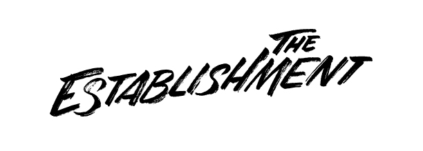
The Establishment logo, designed by PDA Studio and hand-lettered by Jen Mussari
The take-away from Design Taboo is two-fold: hearing other people describe key concepts in their own unique way exposes us to new perspectives. Secondly, by grouping cards by themes that arise time and time again, we are provided with an indication from our collective unconscious of the direction that a project wants to take. On top of these new insights, playing the game also just gets the creative juices flowing and gets us all thinking outside our normal parameters. This helps identify crucial goals amid the many possible goals a project can present, and is a fun, interactive way to jumpstart the process of building an identity or brand.
You can see the final product of the effort that began with Design Taboo at The Establishment's newly-launched website at: www.theestablishment.co

The Establishment, a women-funded and women-fun media company. Site designed by PDA Studio in collaboration with developer Catherine Lewis.